


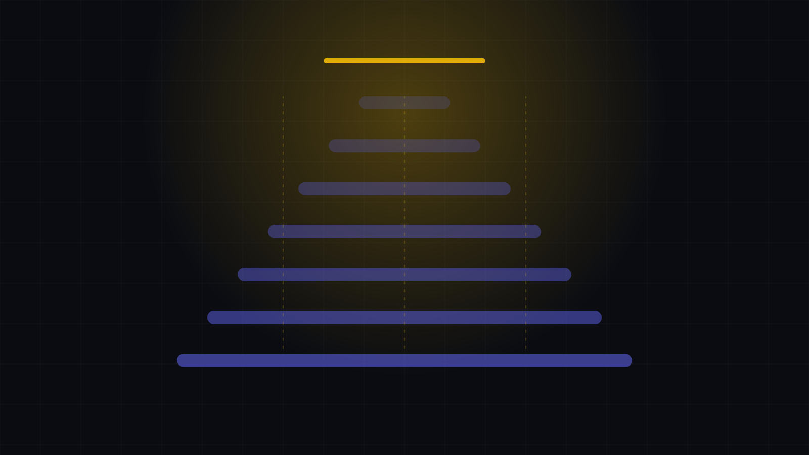
Coverage is a shape, not a number
Two organizations with identical coverage percentages can have completely different exposure.

Coverage usually gets reported as a percentage. Sixty-eight per cent of sites live, four per cent in commissioning, the rest to come. It is a tidy number and it travels well, which is most of why it survives.
It also throws away the only part that matters: where.
The same number, different situations
Consider two territories at the same headline figure. In one, deployment is evenly distributed and the gaps are marginal. In the other, the same percentage is concentrated in two metros and an entire region is empty. These are not comparable situations, and no percentage can tell them apart.
Gaps are invisible in a list
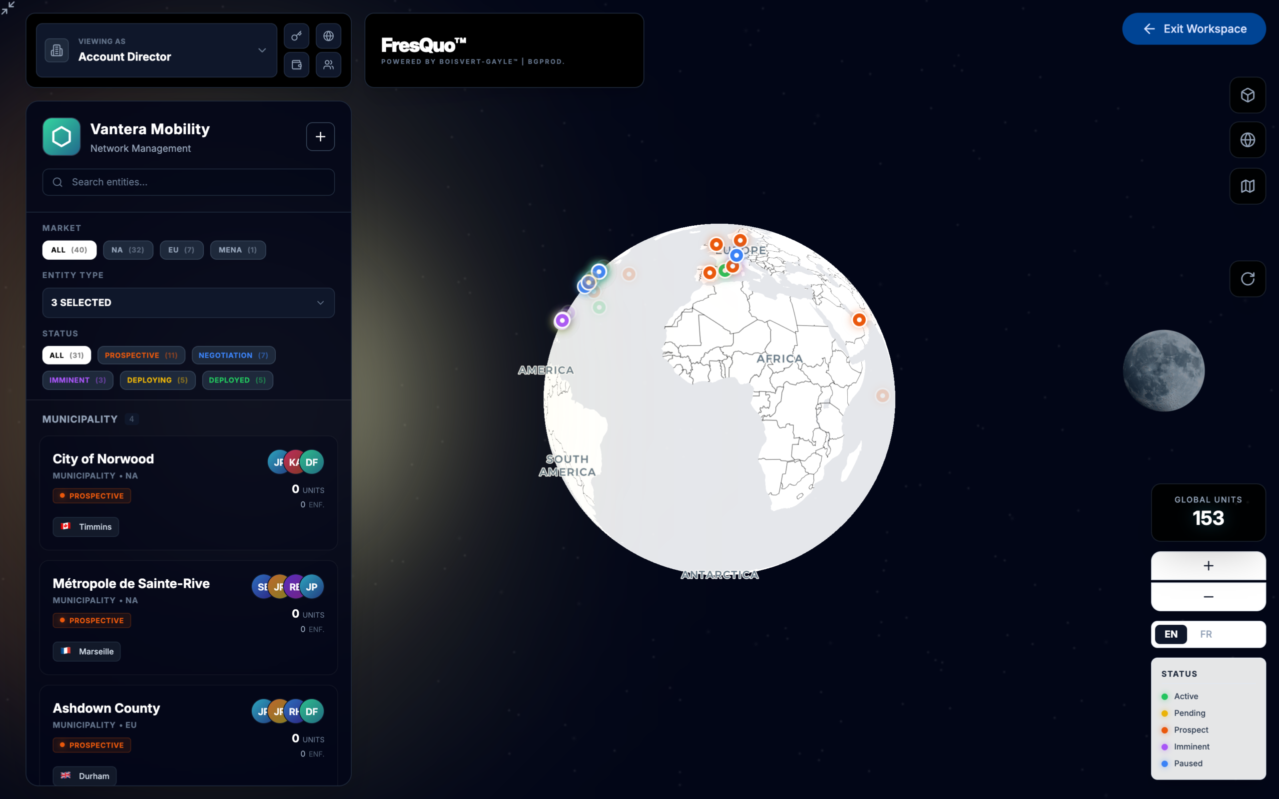
This is the deeper problem. A list can only show you what is there. Nothing is absent from a list — the row simply does not exist, and an absent row draws no attention at all. On a map, the same absence is a hole, and a hole is something people notice without being briefed to look for it.
That difference is worth more than it sounds. Most coverage problems are found late not because the data was wrong but because nobody was looking at it in a form where the problem was visible.
Add status and it gets sharper
Colour the same map by pipeline state and a second layer appears: where deployment is dense but still in commissioning, where negotiation has stalled across a whole region, where a competitor is presumably filling the space you left.
Keep the number, lose the reliance
None of this argues against reporting a percentage. It argues against treating it as the coverage picture. The number is a summary of the shape, and when the two disagree, the shape is the one that is right.